Air pollution has become one of the most pressing global issues affecting both the environment and human health. From large metropolitan cities to small rural areas, the quality of the air we breathe has a direct impact on life expectancy, respiratory health, and the overall well-being of communities.
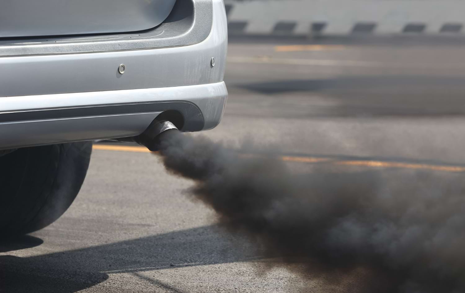
With industrial growth, urbanization, and the increasing number of vehicles on the roads, harmful particles and gases are released into the atmosphere every single day. People have grown more aware of these risks, and with this awareness comes the need for accessible tools that can help individuals monitor and understand pollution levels in real time. This is where the concept of an air quality map comes into play. Such tools serve as both an educational and practical resource, helping individuals, governments, and organizations make informed decisions about health, travel, and environmental policy.
What is an Air Quality Map?
The question many people ask is: what exactly is an air quality map? At its core, it is a digital or physical representation of pollution levels across different geographic areas. Using data gathered from monitoring stations, satellites, and advanced sensors, the map provides a visual snapshot of air conditions at a specific moment in time. These maps usually measure pollutants such as particulate matter (PM2.5 and PM10), nitrogen dioxide (NO₂), ozone (O₃), sulfur dioxide (SO₂), and carbon monoxide (CO). By assigning color codes to different ranges of pollution, the air quality map becomes easy to interpret for the general public. For instance, green may indicate clean air, yellow moderate pollution, and red hazardous levels. This straightforward system allows anyone, regardless of scientific knowledge, to grasp the seriousness of current conditions.

The Technology Behind Air Quality Maps
Behind the simplicity of visual representation lies a sophisticated network of technologies. Data is collected through ground-based monitoring stations, which use sensors to detect concentrations of harmful pollutants. Satellite data supplements this by providing a broader view, particularly useful in regions with fewer ground stations. Advanced algorithms then analyze and combine these datasets, adjusting for weather conditions, wind patterns, and seasonal changes to give as accurate a reading as possible. Machine learning models are increasingly being used to predict future air quality, offering not just a static picture but also forecasts. The air quality map thus becomes a dynamic tool, capable of guiding not only daily decisions but also long-term planning in urban development and public health.
Health and Environmental Benefits
The impact of poor air quality on human health is undeniable. Prolonged exposure to pollutants can lead to respiratory issues such as asthma, chronic bronchitis, cardiovascular problems, and even premature death. By providing real-time insights, an air quality map empowers individuals to reduce their exposure. For example, someone with asthma might choose to avoid outdoor exercise on a day when pollution is high. Parents can use the data to keep children indoors when necessary, while elderly citizens can also take protective measures. On a broader scale, these maps raise awareness and encourage communities to take collective action. They also help environmental organizations and policymakers identify pollution hotspots and allocate resources effectively.
Global Applications and Examples
Around the world, air quality map platforms are becoming increasingly common. Many governments and environmental agencies publish online maps that update hourly. Mobile applications also bring this information directly to users’ phones, making it easier than ever to stay informed. In cities like Beijing, New Delhi, Los Angeles, and Paris, where air quality often drops to hazardous levels, such maps are not just helpful but essential. Some platforms even integrate health recommendations, suggesting whether it is safe to exercise outdoors or if protective masks should be worn. Internationally, projects like the World Air Quality Index provide a global overview, connecting data from thousands of cities into one comprehensive system.

Educational and Social Impact
Beyond immediate health concerns, the air quality map also has educational value. Schools and universities use them as teaching tools, helping students understand environmental science, geography, and public health. They bring abstract scientific concepts into a form that is easily visualized and interpreted. On a social level, they foster community engagement. Residents who notice worsening air conditions in their area may lobby for cleaner transportation policies, stricter industrial regulations, or greener urban planning. The visual nature of a map is particularly effective in communicating urgency to policymakers and the general public alike.